
Brand

Client in 2023
Service
Branding and Identity
UCC, the coffee company, was brewing a new concept: Xpresso, a coffee kiosk meant to provide customers with their on-the-go coffee fix. And a new concept needed new branding. Our task? The logo.
UCC, the coffee company, was brewing a new concept: Xpresso, a minimalist Japanese-inspired coffee kiosk in a shipping container, meant to provide customers with their on-the-go coffee fix. And a new concept needed new branding.
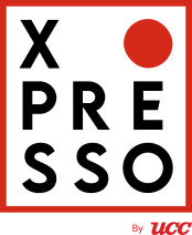
Our main mission was to craft a logo. This logo included several elements, all calling back to UCC’s Japanese heritage. The red circle in the corner represented the Japanese flag while also signifying a stop light, communicating Xpresso as a stopover. Its typography reflects the minimalist typefaces popular in Japan while being visually striking and memorable. All this contained within a black box gives a clean, sleek look befitting of the convenient pick-me-up that Xpresso promises. In addition to the logo, we also created their brand guidelines and designed various materials like packaging and menu layouts.
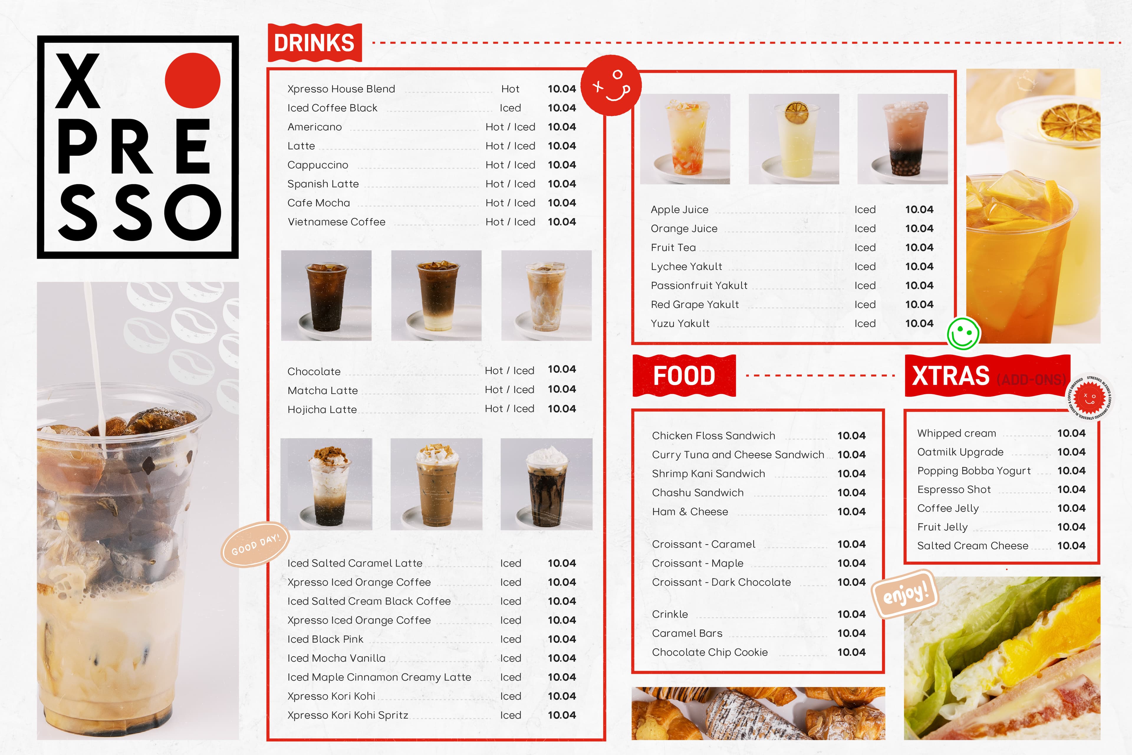
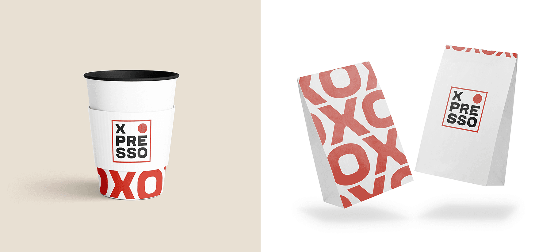
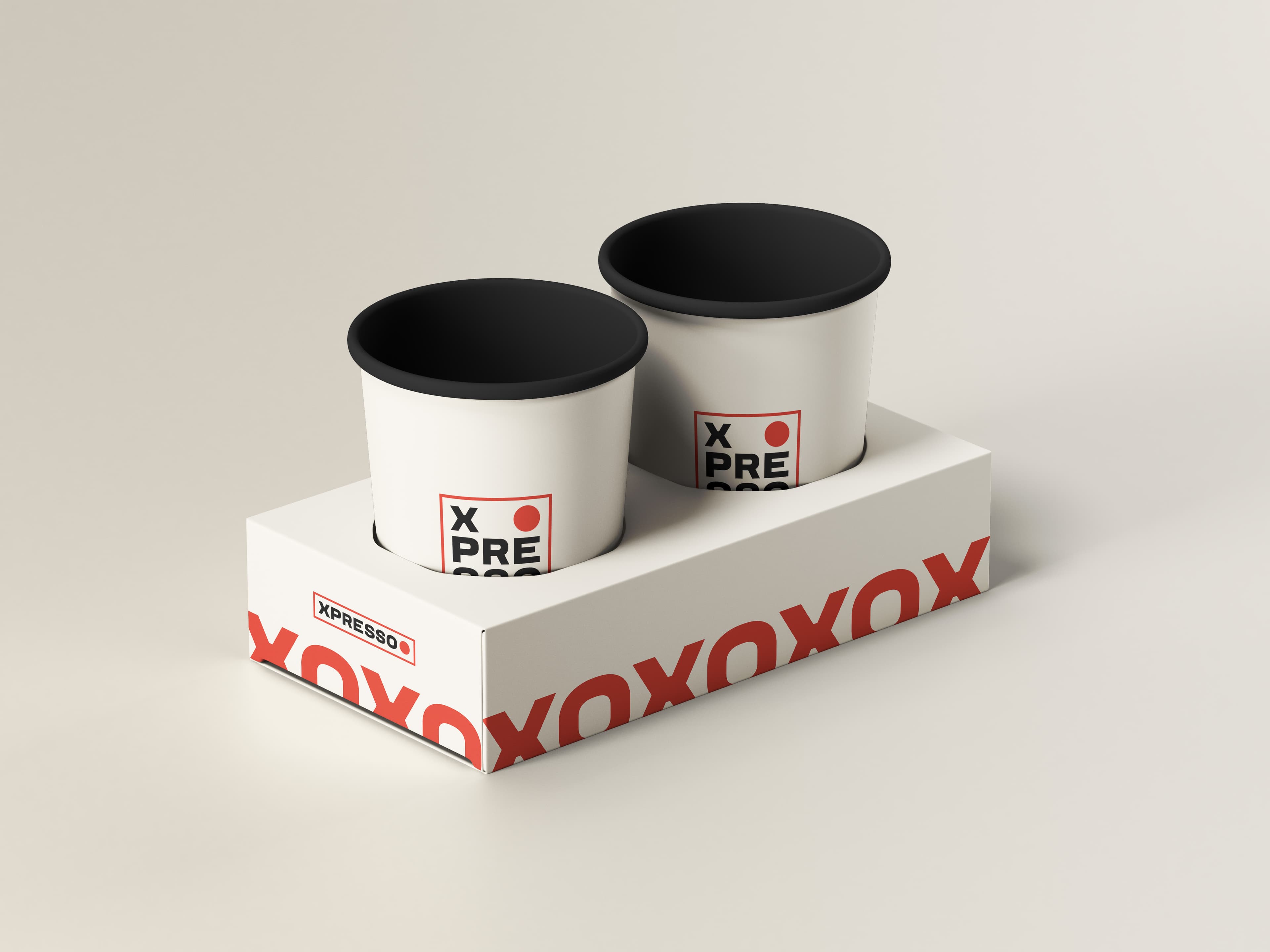
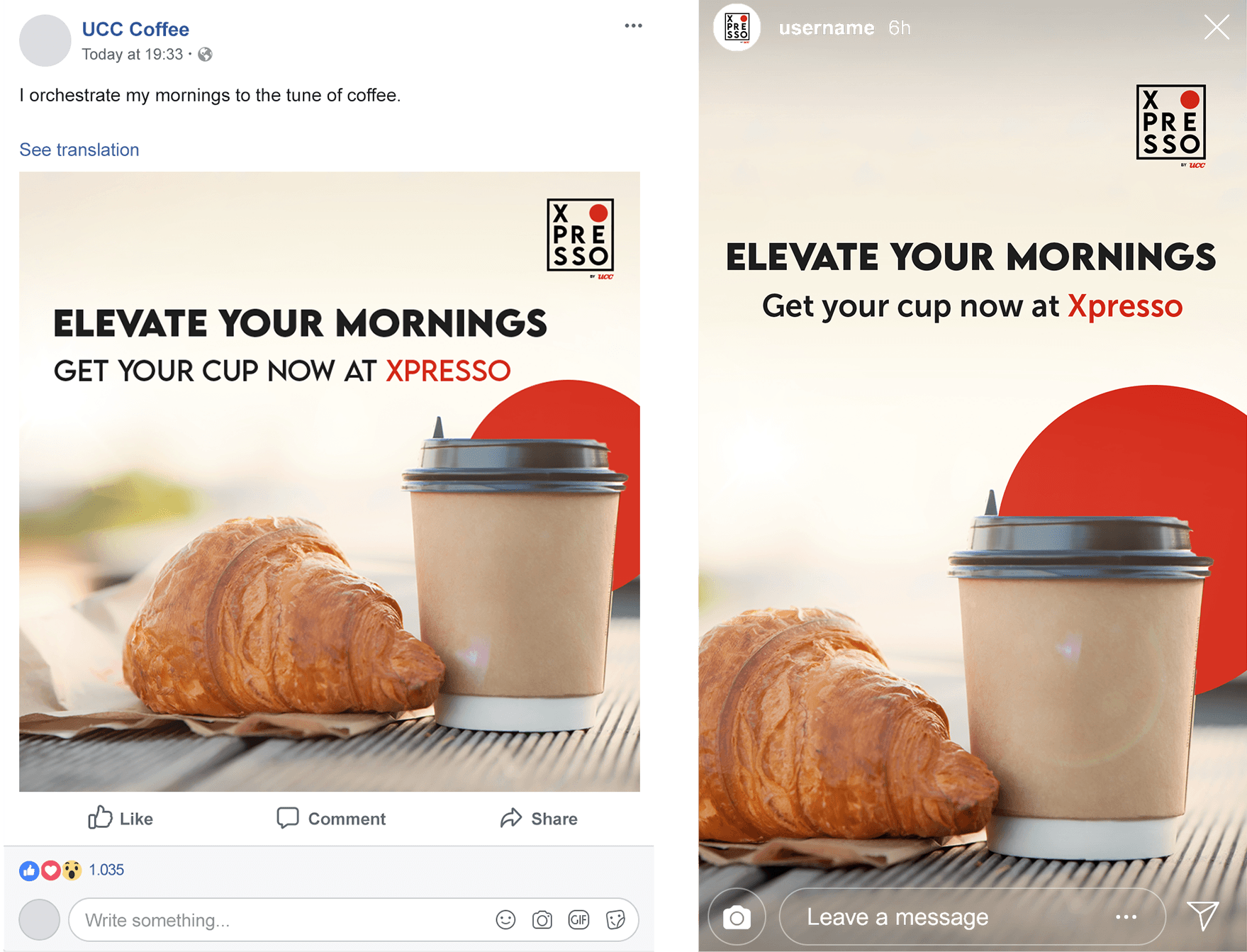
With UCC Xpresso, our visual flair shone through. We aren’t here to just make something pretty, we’re here to make a unique visual identity that brands are proud to own.